MIDO (PREV. TAONGA) APP

About the proJECT

This app was born during the COVID 19 pandemic, when direct interpersonal contacts were suddenly reduced to a minimum, and often even made impossible. In these new circumstances people needed tools that would allow them to securely share sensitive information and documents. 

MY ROLE

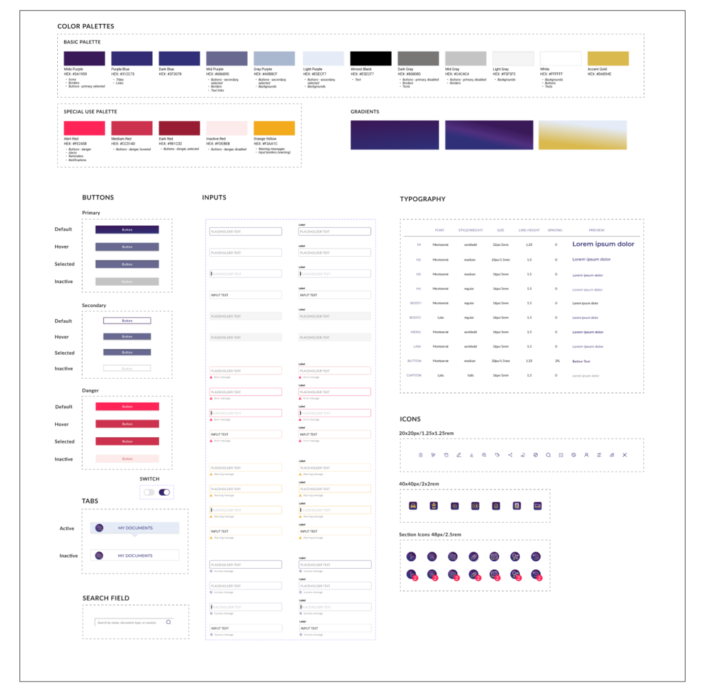
I spent 6 months working on a redesign  and relaunch of the app. I started as a Visual Designer and was responsible for developing branding guidelines, and later, as a UX designer, I worked on the desktop version of the app.

project timeline

Context

The Client, focused so far on selling mainly at jewelry fairs, currently has an ineffective e-commerce website that needs to be thoroughly reworked in order to provide its users with a good online shopping experience resulting in online sales’ growth.

The current inability to either buy products online or, at the very least, have a good overview of the wide range products on offer, frustrates customers and motivates a large percentage of them to leave the brand in favor of competitors whose products can be easily purchased online.

Challenge

t

DISCOVERY PROCESS

DEFINING CORE USER FLOWS

To determine what pages and forms would be needed, I designed user flows for all critical tasks. Each task was then broken down into user journeys through the steps and screens that a user will encounter while completing the task.
In accordance with the design requirements and principles, the flows are thought out as short and  intuitive as possible.

Mido App - managing documents: core user flows

HIGH FIDELITY WIREFRAMES

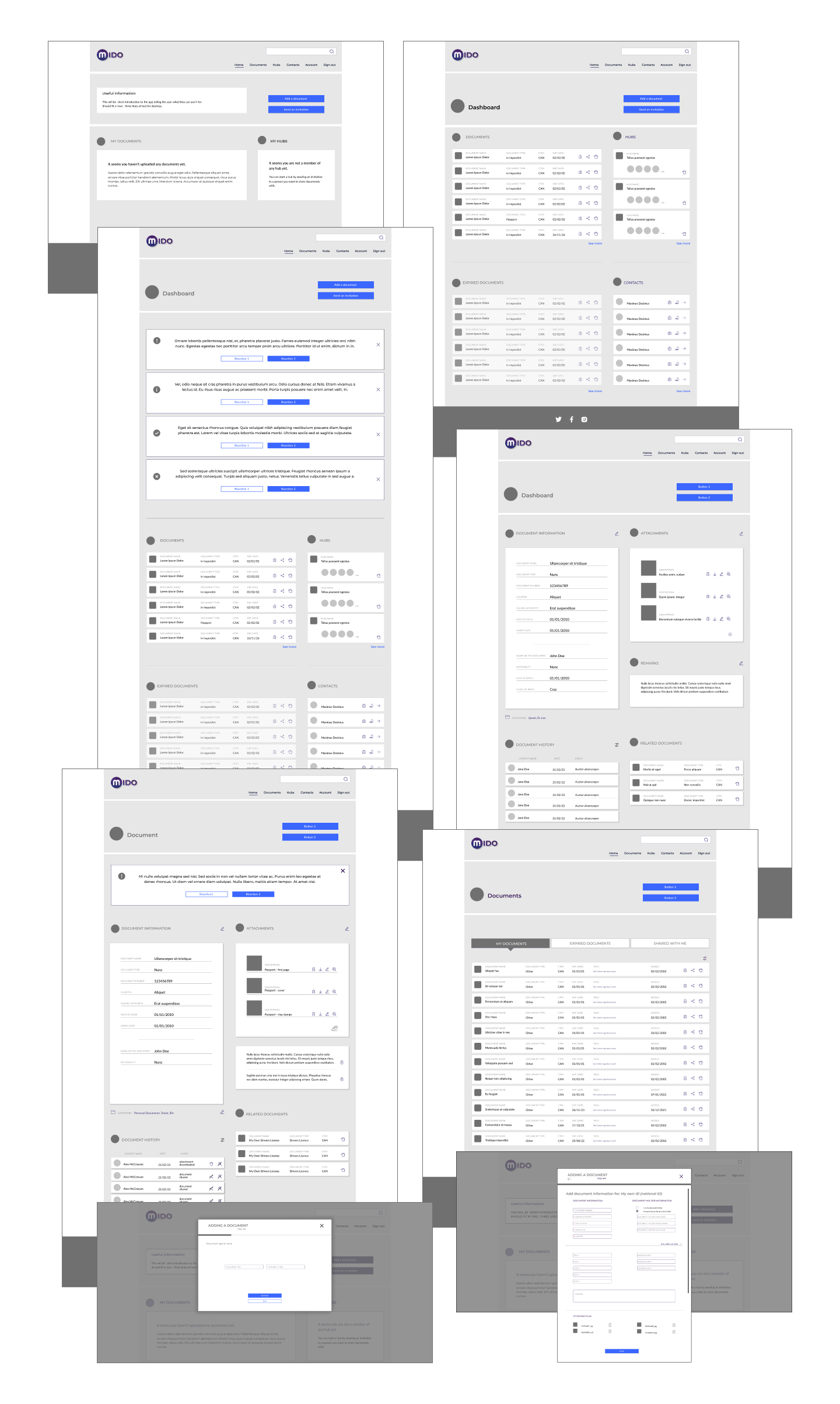
Mido App: high fidelity wireframes

UI VISUAL DESIGN

DASHBOARD

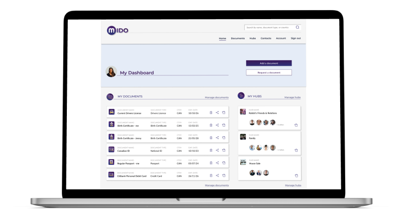
The app’s dashboard gives overview of it’s most important sections and offers easy access to their content, but it’s most important features are the CTA’s encouraging users to take one of the two basic actions: add a new document to their account or request a document from another user.

If there is noting to show in a section, an empty message is displayed and a prompt for the user to take an action. As long as the user has no contact, the ‘Request a document’ option is not available to them.
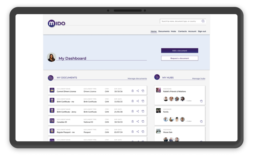
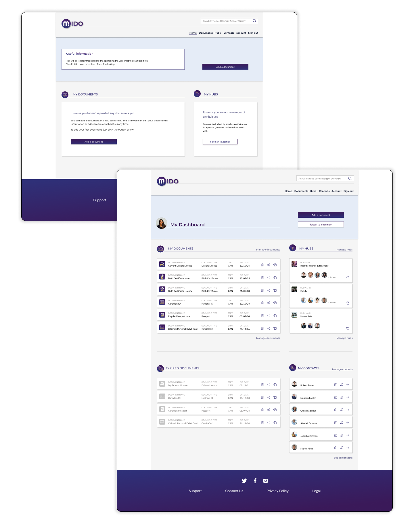
Mido App: dashboard view
Mido App: dashboard design

ADDING DOCUMENTS

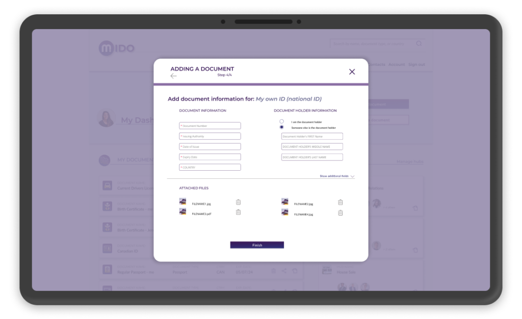
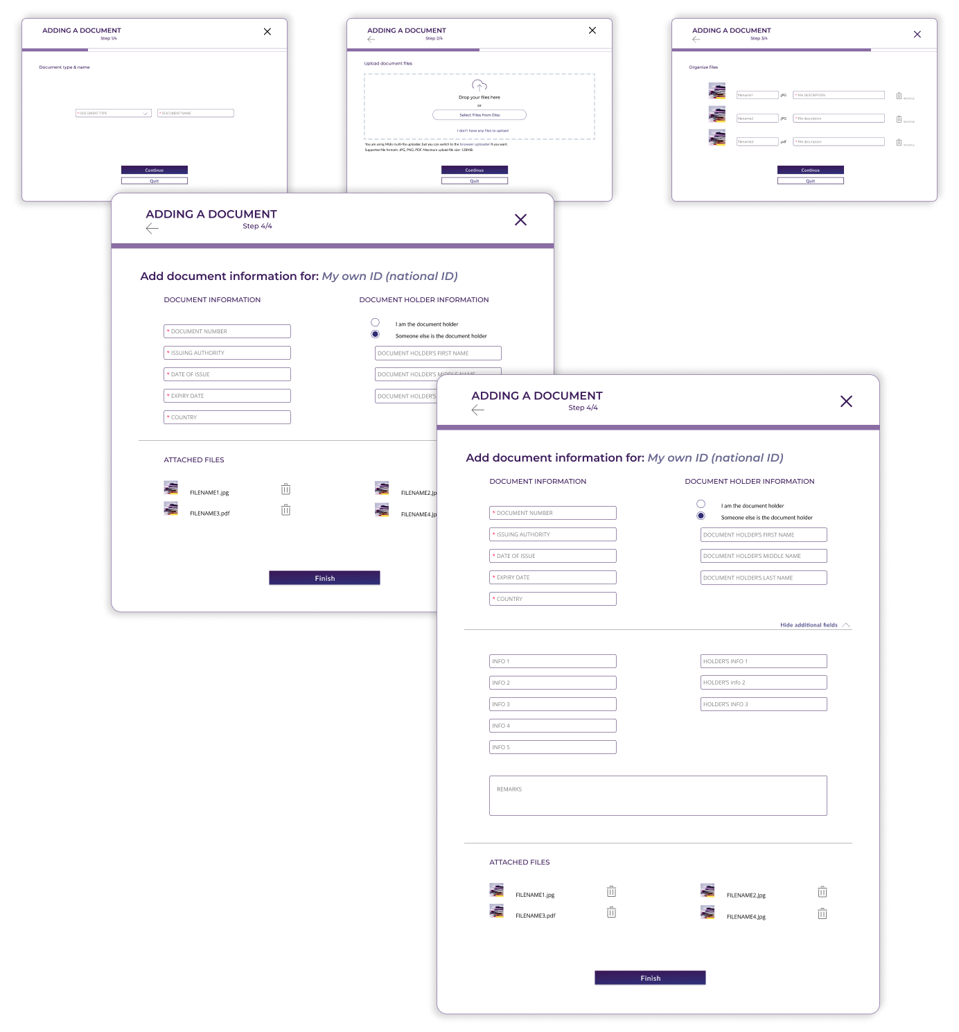
Adding a document is quite a complex task and requires taking various actions. To help users understand what they need to do, the whole process is split into a few easy steps, each of which is clear and straightforward.
When adding a document a user users can decide how much information about the document they want to enter at this point (only basic information is obligatory), they also have the possibility to rename attachment files and add their descriptions.

Mido App: adding document
Mido App: adding a document pop-up

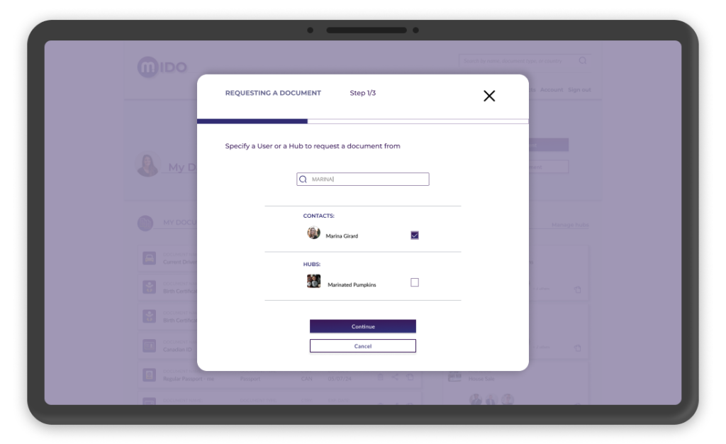
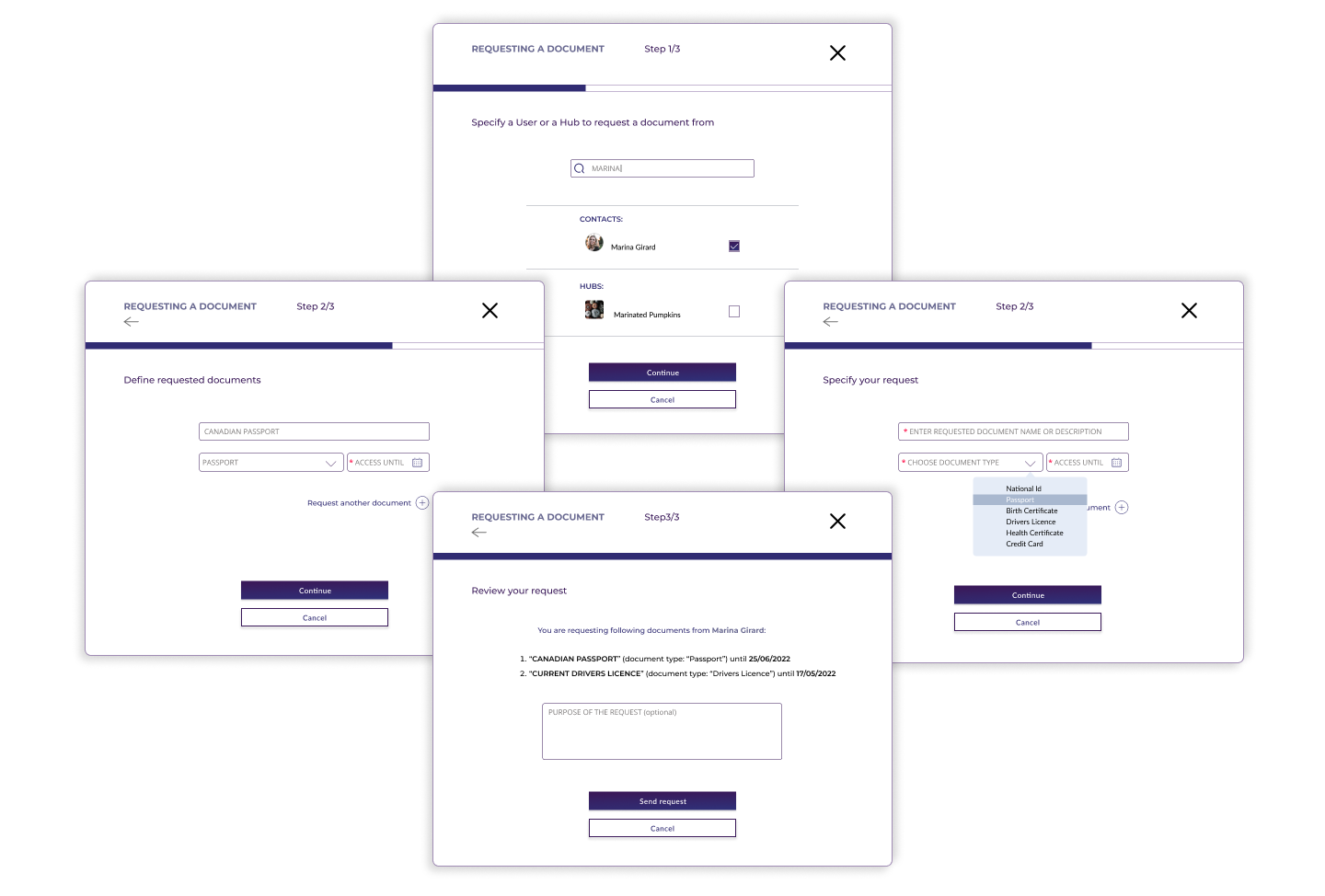
REQUESTING A DOCUMENT

Adding a document is quite a complex task and requires taking various actions. To help users understand what they need to do, the whole process is split into a few easy steps, each of which is clear and straightforward.
When adding a document a user users can decide how much information about the document they want to enter at this point (only basic information is obligatory), they also have the possibility to rename attachment files and add their descriptions.

Mido App: requesting a document
Mido App: requesting a document pop-up

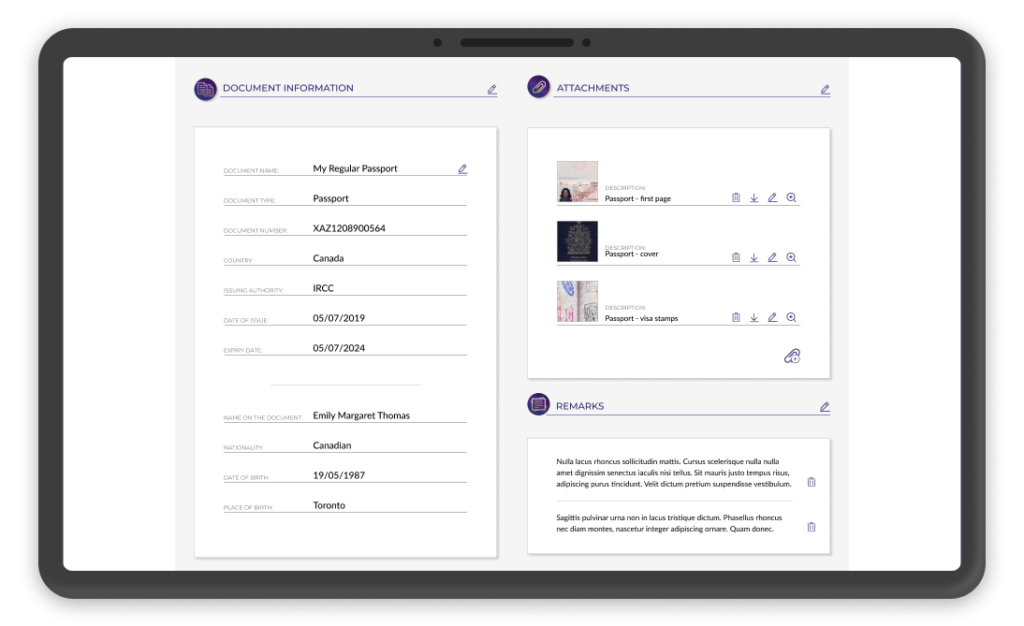
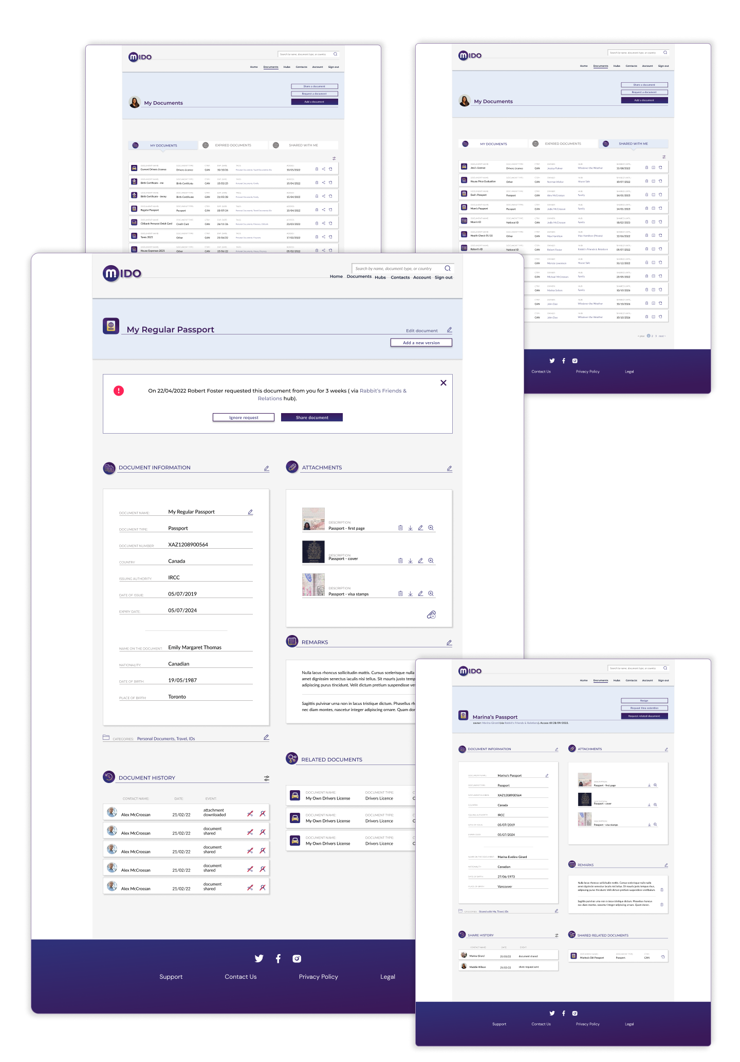
Managing Documents

Adding a document is quite a complex task and requires taking various actions. To help users understand what they need to do, the whole process is split into a few easy steps, each of which is clear and straightforward.
When adding a document a user users can decide how much information about the document they want to enter at this point (only basic information is obligatory), they also have the possibility to rename attachment files and add their descriptions.

Mido App: document screen
Mido App: managing documents

DESIGN SYSTEM AND STYLE GUIDELINES

Adding a document is quite a complex task and requires taking various actions. To help users understand what they need to do, the whole process is split into a few easy steps, each of which is clear and straightforward.
When adding a document a user users can decide how much information about the document they want to enter at this point (only basic information is obligatory), they also have the possibility to rename attachment files and add their descriptions.

Mido App: design guidelines
Contact And availability

I am a freelancer and I’m always open to new challenges and possibilities.
I usually work remotely, but I also love to travel.

So please, get in touch. You can use the short form on the right, drop me an email, message me on LinkedIn, or connect with me on Upwork.

MY Projects: