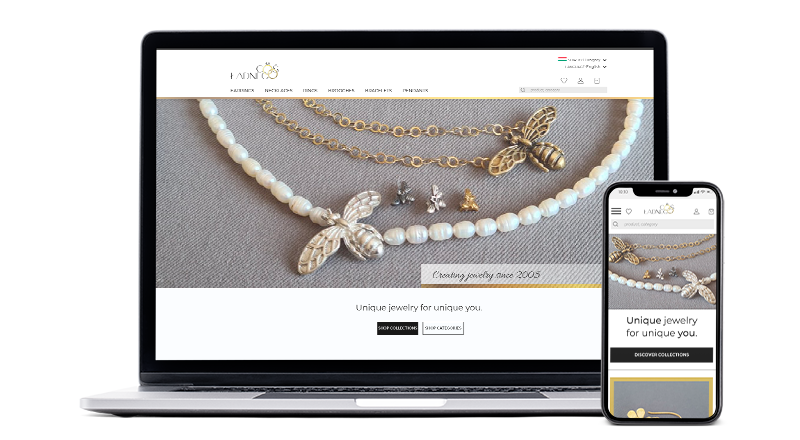
Cos Ladnego (Something Pretty) is a small family business selling handmade jewelry that needed a new website to help them gain new customers and increase sales.
Before COVID, most of their sales happened at jewelry fairs all over Poland, and their very basic website was generating rather low income. Things changed during the pandemic when all fairs were cancelled: online sales went up, but still 90% of customers were returning ones, who used to be making purchases at fairs. The business owner decided to rework the website in order to attract new customers, also from abroad, and ensure online sales increase by at least 100% in the first 6 months after launch.
As a freelance UX/UI Designer I collaborated with Cos Ladnego team consisting of the Project Manager, a copywriter and an in-house developer.
My job was first to review the current website and suggest improvements, and then to carry on with all design process stages from research, through ideation (sketching, wireframing, lo-fi prototyping), through hi-fi mockups, prototypes and usability testing, to design hand-off.
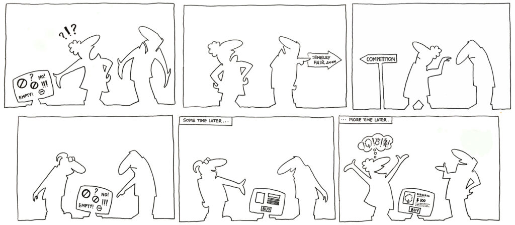
The Client, focused so far on selling mainly at jewelry fairs, currently has an ineffective e-commerce website that needs to be thoroughly reworked in order to provide its users with a good online shopping experience resulting in online sales’ growth.
The current inability to either buy products online or, at the very least, have a good overview of the wide range products on offer, frustrates customers and motivates a large percentage of them to leave the brand in favor of competitors whose products can be easily purchased online.
To help the Client achieve the goal of increasing their revenue from online sales by attracting customers to their website and ensuring high conversion and retention rates, we crafted an engaging and inviting user experience, leading users to find and buy products in an easy and intuitive way.
High quality content, intuitive navigation, versatile search and filtering options, and a simple and quick checkout process are easy to understand and accessible to any user, regardless their technical experience or skills.
The visual aspect of the website, now consistent with other branding assets, not only attracts customers, but also becomes an essential part of the brand image. Being recognizable and memorable, the site makes it easier for customers to identify with the brand and bond with it.
No. Not because we need ‘something better’.
We’re doing this to make our users happy and to help the Client achieve their goals.
The Internet is full of clichéd e-commerce websites that nobody remembers and nobody cares about (except for their owners).
We are doing this to have a website that does not fall into the above category, but is memorable and valuable to its users who need it to buy the jewelry they love from a company they trust.
We also are doing this so that the Client can reach their customers in the periods between fairs, gain new customers, and help them build a bond with the brand (which, of course, will translate into growing profits).

Even in user-centered design not all is about users.
People also live on the other side of the fence – and it just so happens that they finance the project. It is our responsibility to discover their goals, understand why they matter, and then consider how our design can be of best value to both the users and the Client.
The ultimate business goal seems, of course, quite obvious. After all, businesses want to make money.
But hey, “making money” isn’t specific enough to be the North Star for us to focus on during the design. We need to define goals that are more clear-cut and that will lead us to the desired outcome.
Later we’ll put the business goals next to the users’ needs to find out what and where we can do in order to satisfy both camps, and how the success of the website will be measured on each side.
To keep things short, here are the main objectives as the Client sees them:
We need to know what’s wrong before even starting to think about what we could do right.
Even if we’re quite sure that everything we have is going to end up in trash.
Maybe you noticed that the Client’s objectives above don’t mention things like “conversion rate”, “shopping cart abandonment”, etc. Strange? Not really, when you realize there is no such thing as a shopping cart on their current website…
Anyway, it was quite obvious to everyone that the existing website had to be radically reworked in order to be efficient from both the users’ and the business points of view (and that’s a polite way of saying that a redesign won’t save that thing, and that a brand new website is being called for).
In this situation, one may wonder why bother with conducting a UX / UI audit – but I decided to use the audit as an eye-opener for the client. Realizing now what (and why) was wrong with their current website allowed them to better understand the new solutions later.
Performing the audit, I evaluated all relevant areas of the existing website:
So, let’s see what we’ve got.
Just to validate the idea of creating something brand new.
Current Cos Ladnego website is built with WooCommerce but doesn’t take advantage of its main functionality. Customers cannot buy products online, and the only way of placing an order is giving Cos Ladnego a call and then making a money transfer to pay for ordered goods.
The informative Both visual and text content is kept to a minimum that is not useful nor helpful, and it doesn’t answer most questions the customers would like to have answered. Quite often ‘happy talk’ is used in place of product descriptions, and there is no information available on how to buy, unless a contact phone number is considered such an information.
Other issues had to do with navigation (confusing main menu, lack of current location indication, lack of breadcrumbs), poor interaction, and very poor visual design.
Performing the audit, I evaluated all relevant areas of the existing website:
Addressing the Competition
Because no business is an island, and the Internet is a crowded place. We need to identify areas where there is enough space for us to create competitive advantage.
Each of the 5 top competitors pointed out by the Client, has a legitimate shot at taking over those of our customers, who want to shop online.
The diagnosis why people turn to competition, at this point, is simple: Cos Ladnego website, non-functional and ruining the brand image, is counterproductive and encourages potential customers to buy elsewhere. The competition is taking advantage of the situation that the Client created themselves, but that doesn’t mean that the day Cos Ladnego launches their website the customers will be back (together with some new ones).
But looking at the competitors we noticed, that in many aspects their business models differ from that of the Client. The biggest difference is Cos Ladnego presence and visibility at jewelry fairs and their direct contact with their customers. This creates a number of opportunities that we can explore and leverage during the design process.
Our competitors:
Apart.pl, wkruk.pl, etsy.com, trendymania.pl, srebroartystyczne.pl
Our opportunities:
Trying to satisfy everyone we’d most likely end up satisfying no one.
We want to satisfy those who care about our products; ergo, we need to get to know them better and discover their needs.
The Client had some observations to share concerning their current customers. That was a good starting point, but I needed more in-depth data in order to gain insights not only on customers’ demographic, but also on their mental models, buying habits, motivations and pain points. I also wanted to find out what our users might expect from our new website.
In order to gather data on users I used both qualitative and quantitative research methodologies:
DEMOGRAPHIC INSIGHTS
PSYCHOGRAPHIC INSIGHTS
INSIGHTS ON BUYING HABITS
INSIGHTS ON MOTIVATIONS
Emotional motives
Rational motives
INSIGHTS ON PAIN POINTS
INSIGHTS ON EXPECTATIONS
Emotional motives
Rational motives
Personas are a key part of the user-centered design process.
By defining users’ concerns, motivations and expectations they help us to stay focused on the right goals.
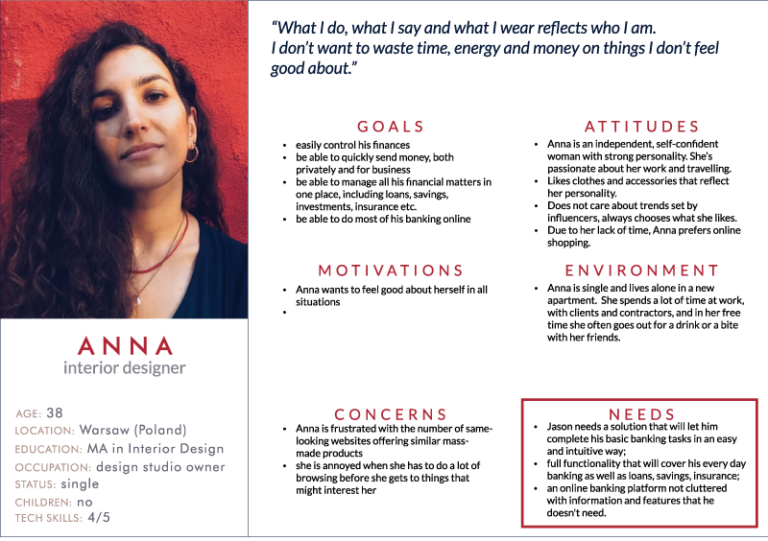
In the research insights we found patterns that led us to developing a set of four personas. These imagined characters would help us learn about the spectrum of users’ needs and goals, and to understand how to design a website that will satisfy our users.
To describe problems to be solved with the design we crafted a user story for each persona, and we used user journey maps to illustrate personas’ interactions with the website. All this helped us to easily spot problems and potential issues in the user-website relationship.
The personas, as well as the user stories and user journey maps, were being regularly revised and updated to help everyone stay on the same page throughout the whole design process.
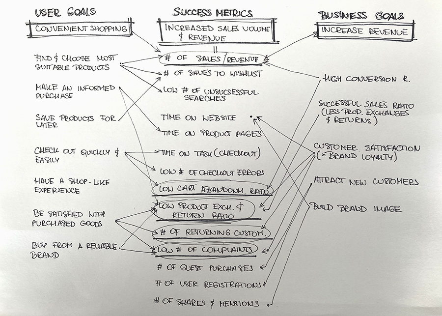
Goals and success metrics impact and inform functional and technical requirements.
Defining the areas where the goals of both the Client and the users align helps to develop strategy, identify the main KPIs and focus on what matters the most.
Good performance only has value if you can understand why it happens. Putting user goals next to business objectives helped us understand how they are related and how they affect each other, and find out where the goals are aligned. Areas of alignment will be the basis for developing our UX strategy for the website.
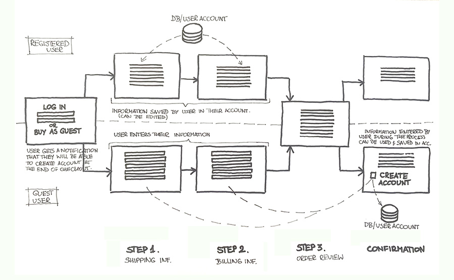
To determine what pages and forms would be needed, I designed user flows for all critical tasks. Each task was then broken down into user journeys through the steps and screens that a user will encounter while completing the task.
In accordance with the design requirements and principles, the flows are thought out as short and intuitive as possible.
There are many doors the users can take.
Not all users start their journey on the home page, some of them land directly on the product pages. No matter where the users arrive, they all should have the same opportunities to explore the website and discover products.
There are two major scenarios for users getting to Cos Ladnego website. Those looking for particular jewelry items on Google will most likely arrive at one of the product pages, while those who either already discovered the brand (via fairs, social media or word of mouth), or are searching for handmade jewelry in general, will end up on the home page.
Having multiple entry points created a challenge: we needed to provide all users – no matter where their journey starts – with similar user experience, and with the same opportunities to discover everything the brand has to offer in most intuitive ways.
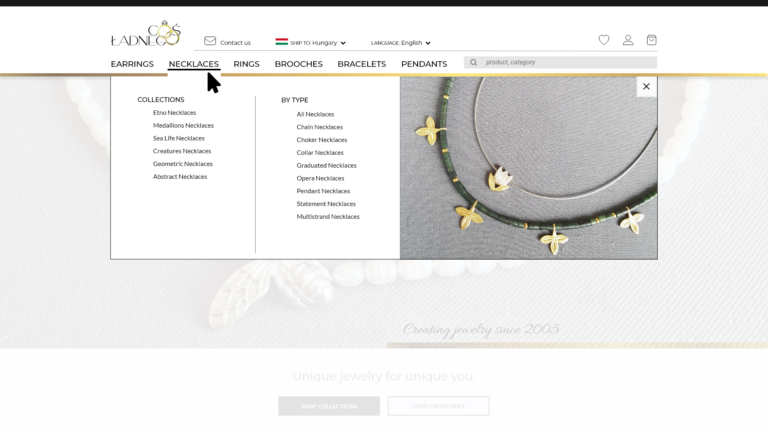
To achieve this, we decided to provide visual presentation of all product categories, collections and types in the one place that is easily available no matter where the user is: in the menu.
Don’t show off everything. Let them be curious.
Putting too much stuff in a window prevents people from entering the shop and engaging in exploration.
Of course, visual presentation of all categories and collections on the home page is always a safe (and often the best) solution. We felt that we needed something more than “safe” for a website selling unique handmade jewelry; we wanted “intriguing”…
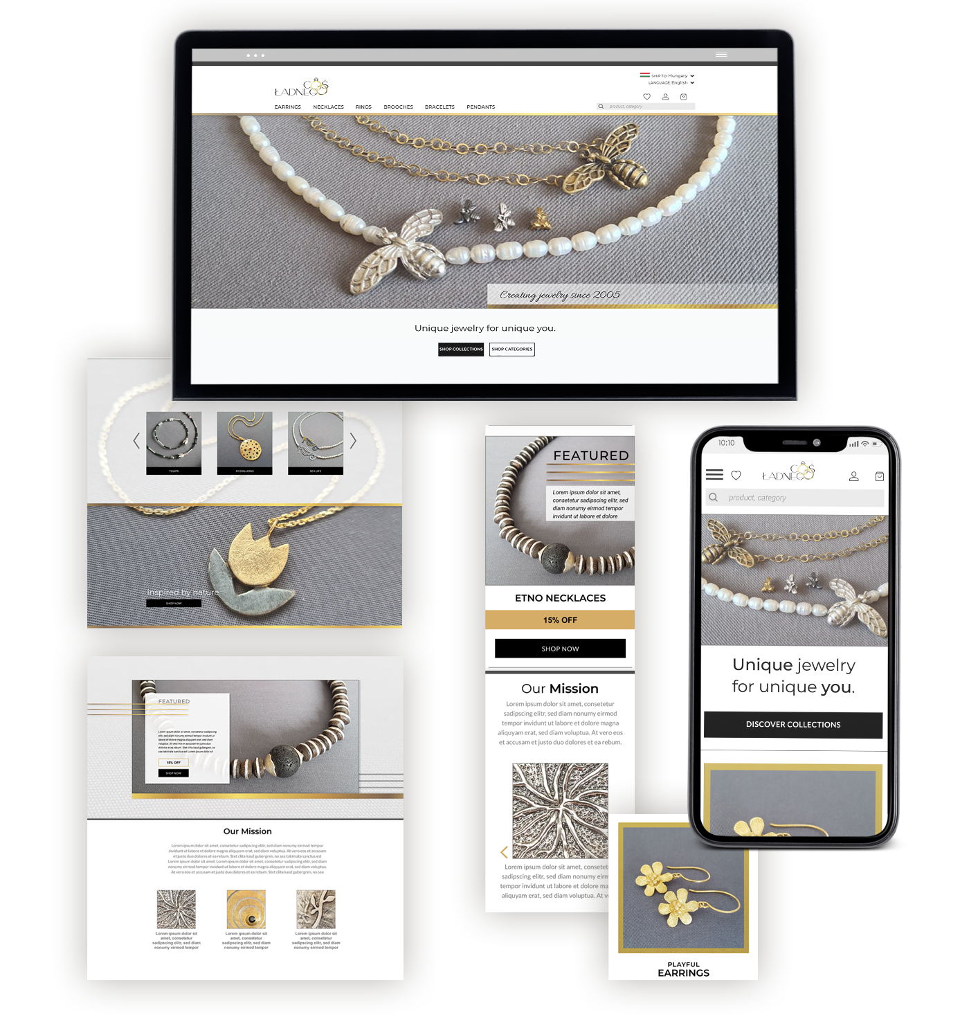
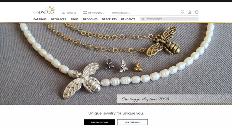
We decided to use the home page to tell a story and invite users to explore the website in a way they like.
The most prominent call to action buttons invite users to shop by categories or by collections, they also can go directly to a few featured collections, discover special offers, or follow the link that takes them to the ‘About us’ page, where they can get to know the brand and the faces behind it.
The challenge here was to find the sweet spot between what would be not enough to interest users, and what would be too much to keep them excited and curious.
Show them possible directions and make the destinations clear. Then let them choose their path.
Providing users with unclear or enigmatic information on what they will get after clicking a link can lead not only to disappointment and frustration, but also to leaving the site before even getting a good picture of what it has to offer.
The content is very important, but in 99% cases it is not enough to keep users engaged and convert them into buyers. Not because users don’t care about content (they do!), but because it is difficult for them to get to the content they need. They get annoyed and they leave, often to never come back.
We don’t want our users to leave just because they assume there’s nothing for them on the website. We want to encourage them to browse and to spend time with the brand, and we want the site to be entertaining and inspiring to them. We don’t want users’ disappointment nor frustration coming from the fact that what they get is not what they thought they’d be getting.
The best way to encourage someone and minimize their frustration is to give them reliable feedback on their actions as soon as possible. Or sooner, like, before they even take action.
And that is up to the navigation.
We wanted navigation to be intuitive, engaging and super sufficient. It had to not only help people to get where they want, but also help them to not go where they have totally no interest in going.
To get there, all we needed to do was to give users clear information about what they would find under each link, so they could immediately see what is interesting to them and what’s not. But in case of a jewelry shop that’s easier said than done…
As long as the category names and jewelry types within each category were easy and obvious, we had a problem with collection names not carrying enough information for users to understand what’s behind those names.
We considered many options (skipping collections was not one of them, users definitely want to browse by collections). We came to the conclusion that a visual message would be the best way to explain to users what each collection is about. And the best way to get that message across would be a mega menu with clear images of sample jewelry.
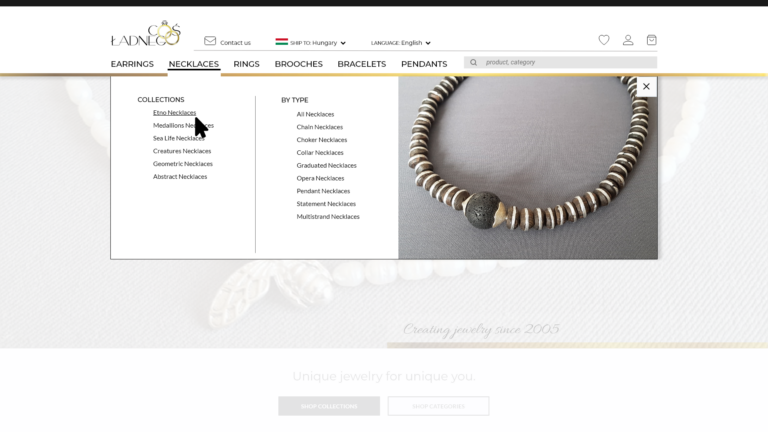
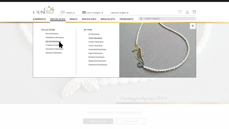
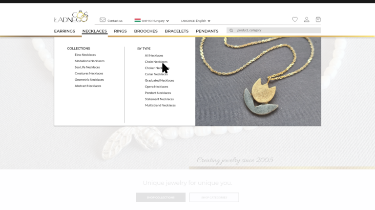
Sometimes the goal is speed.
When users are in a hurry or not in the mindset to stick around and spend their time with the site, then getting them to the right product, letting them know it is the right product, and taking them to checkout is the best thing that the website can do.
Most Cos Ladnego customers enjoy the shop-like experience that comes from browsing categories and collections. But browsing is the long way to find what one likes, and sometimes users do need a shortcut in order to quickly find desired items.
And the fact is, people using the search box are often in buying mode and they are shopping with intent, so they are more likely to purchase than those just looking around. But in order for the search box to work, the search experience has to be user-friendly, and the results must be relevant.
To make the search feature sufficient and enjoyable to users, we use an auto-complete tool that starts to offer suggestions after a user has entered a few characters into the search box. This not only speeds up the search process for users and helps them to avoid misspellings, but it also ensures that searches do return results.
As for the zero results page, we leverage it by not only suggesting few of the most popular items, but also by encouraging the user to browse categories or collections.


Too much of a good can be bad. Let them remove what doesn’t suit them.
The more choice options users have, the more difficult and time-consuming it becomes for them to select just one.
People visiting category/collection/search results pages might be overwhelmed with long lists of products, and then they need a way of
After some brainstorming and testing, we decided to design a collapsible horizontal filter bar above the product list. A horizontal bar is more convenient and effective than a sidebar, and since we only had to deal with a limited number of categories and filter criteria, we considered this solution safe and feasible.
Don’t push. Encourage them, boost their confidence and gain their trust.
Supporting users in forming their own opinions and making informed buying choices builds their trust and brand loyalty, while provoking impulsive purchases often results in customer dissatisfaction and numerous product returns and exchanges.
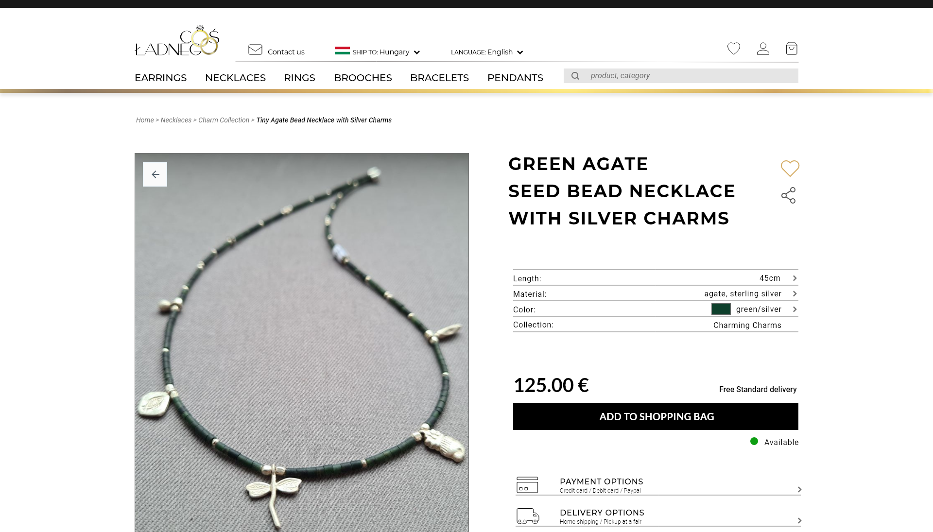
Users don’t want to guess if a product is right for them, they want to be sure of that. They come to a product page to have the stuff explained and to find out what they’ll gain, if they decide to buy. They want the information they get to be relevant and trustworthy, and they want answers to their questions.
In fact, our audience considers reliable information to be of more value, than customers’ reviews and ratings.
Our goal for the product page was for it to not just convert, but also to help building users’ trust and loyalty for the brand. To achieve that we focused on
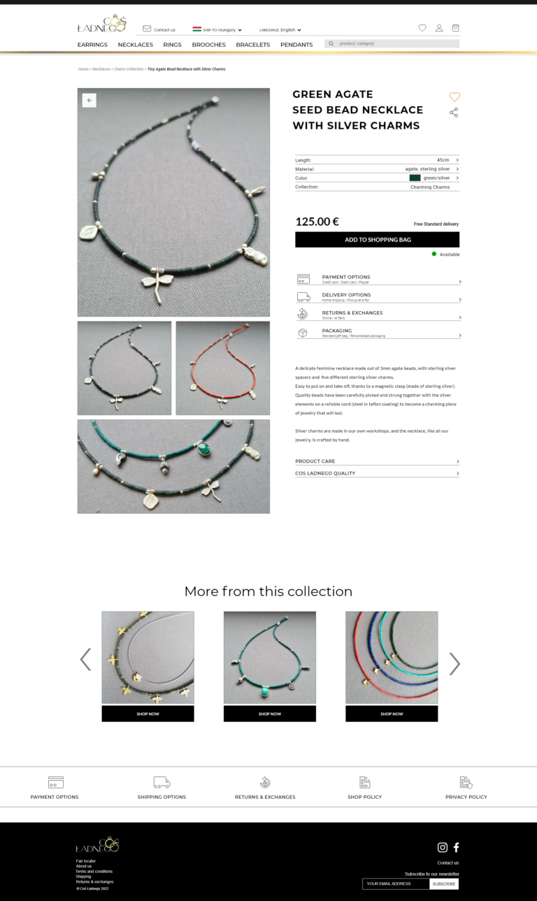
Users want to be sure. Assist them in making their final decisions and going to checkout.
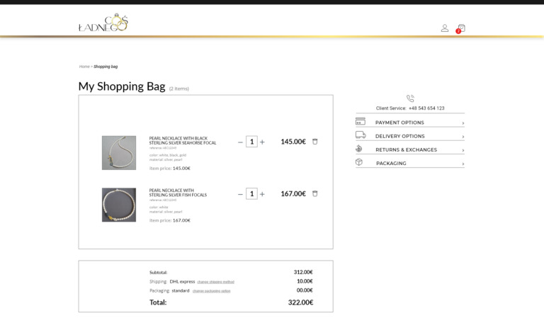
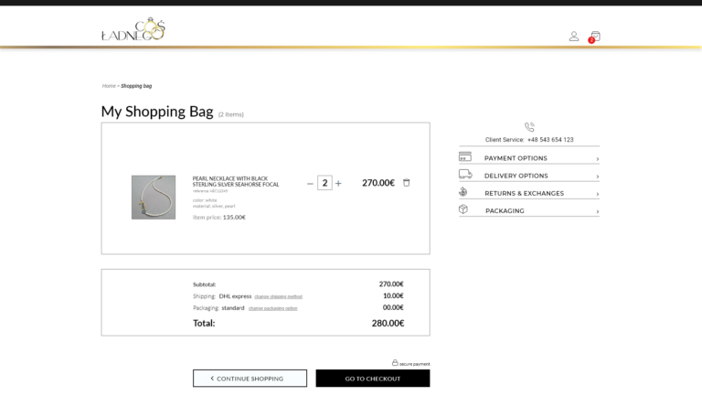
Providing users with the opportunity to view, compare and confirm items in their cart before proceeding to checkout helps them stay more focused during the checkout process.
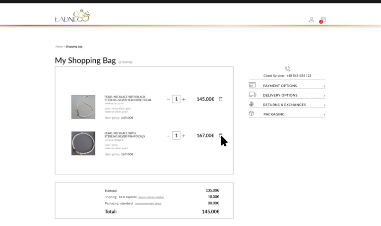
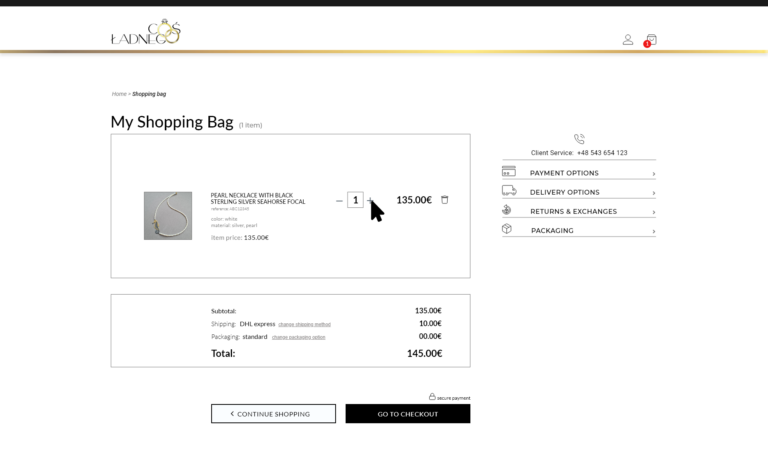
Users may get frustrated and distracted when they realize that they want to edit their order only after they’ve reached order confirmation pages. It is important to allow users to use their carts also as a holding area where they can hold and compare items before making their final purchase choices and proceeding to checkout.
A minicart is a quick way of reviewing items in the cart, but it gives users only limited access to information about products. We decided to allow users to easily compare, edit, and remove items on a dedicated cart page that clearly summarizes the items in the cart.
We also provided quick access from the cart to the product pages.
Users don’t like complications. Give them a convenient way to close the deal.
Until users hit that ‘Place order’ button, they still can opt out of a transaction. And it is complications at the checkout stage that largely contribute to high cart abandonment rates.
Users may get frustrated and distracted when they realize that they want to edit their order only after they’ve reached order confirmation pages. It is important to allow users to use their carts also as a holding area where they can hold and compare items before making their final purchase choices and proceeding to checkout.
A minicart is a quick way of reviewing items in the cart, but it gives users only limited access to information about products. We decided to allow users to easily compare, edit and/or remove items on a dedicated cart page that clearly summarizes the items in the cart.
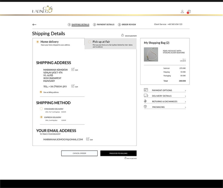
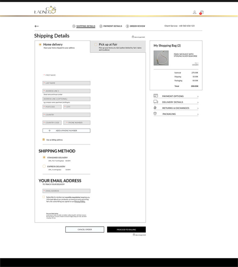
The result of this project is a new, elegant storefront that fits with Cos Ladnego brand image, and aims to increase customer conversion and retention rates in order to achieve the expected business goals.
Once launched, the platform will be maintained by the in-house team, who will not only monitor the metrics, but also check on how customers use the site and if any improvements are needed to make the website even more efficient.
When planning the strategy we prioritized features basing on their importance and feasibility/viability, and we chose those to be implemented before the launch. A list of features to be introduced at a later time, together with design outlines and criteria required for implementation, is an integral part of this project.
There is no doubt that user research and user testing are crucial elements of user-centered design, and in an ideal world UX designers would always be able to conduct extensive research and run thorough tests throughout the whole design process. In real world, however, quite often there are circumstances (usually time and/or budget) that make the ideal scenario impossible. What then?
The truth is, in many cases we don’t have to go through an extensive research checklist in order to understand users, identify their needs, and design a good product. Secondary research can be very effective and, unless we are designing something very innovative, or highly specialized, there are a lot of sources we can rely on, if we only know where and how to look.
You are also welcome to take a look at my GRAPHIC DESIGNS where you can find examples of my designs for web as well as for print.
| Cookie | Duration | Description |
|---|---|---|
| cookielawinfo-checkbox-analytics | 11 months | This cookie is set by GDPR Cookie Consent plugin. The cookie is used to store the user consent for the cookies in the category "Analytics". |
| cookielawinfo-checkbox-functional | 11 months | The cookie is set by GDPR cookie consent to record the user consent for the cookies in the category "Functional". |
| cookielawinfo-checkbox-necessary | 11 months | This cookie is set by GDPR Cookie Consent plugin. The cookies is used to store the user consent for the cookies in the category "Necessary". |
| cookielawinfo-checkbox-others | 11 months | This cookie is set by GDPR Cookie Consent plugin. The cookie is used to store the user consent for the cookies in the category "Other. |
| cookielawinfo-checkbox-performance | 11 months | This cookie is set by GDPR Cookie Consent plugin. The cookie is used to store the user consent for the cookies in the category "Performance". |
| viewed_cookie_policy | 11 months | The cookie is set by the GDPR Cookie Consent plugin and is used to store whether or not user has consented to the use of cookies. It does not store any personal data. |